
Infographic: Global carbon dioxide emissions
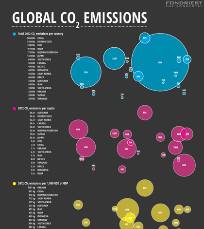
Infographic on global carbon dioxide emissions. (Credit: Nate Christopher / Fondriest Environmental)
With 2014 officially in the books as the hottest year on record, it’s a fine time to share the web version of our infographic on global carbon dioxide emissions that originally ran in the Winter 2014 (PDF) print edition of the Environmental Monitor (get a free subscription here).
The graphic, assembled by our designer Nate Christopher, breaks down 2012 carbon dioxide emissions by country, where China took the top spot and nearly doubled the output of the United States, the second-biggest emitter. But when considering those emissions as a rate per capita, Australia rises to the top while China drops to the tenth spot. Calculated as a rate per unit of GDP, China rises back to No. 2, falling short of Ukraine.
Though the 34.5 billion tonnes of carbon dioxide emitted globally in 2012 continued a long trend of outpacing the year before it, the 1.1 percent increase over 2011 levels is down from the 2.9 percent average annual increase since 2000.
According to a study from scientists at the Carnegie Institution for Science, any warming caused by these carbon dioxide emissions should occur by 2022.

Global Carbon Dioxide Emissions infographic (Credit: Nate Christopher / Fondriest Environmental)


0 comments