
New Scientist’s global temperature tool shows local warming
By Daniel Kelly on February 11, 2014
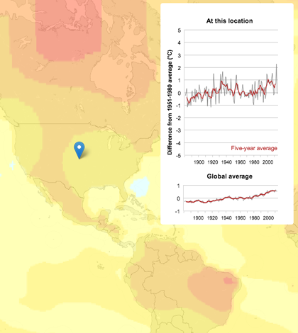
New Scientist's warming map (Credit: New Scientist)
New Scientist has built an interactive graphic display to show changes in global temperatures from 1894 to 2013. It’s available online and uses data from NASA’s Goddard Institute for Space Studies.
The real benefit of the tool is that visitors can specify their location and see how temperatures in their area have heated up over time. This can be set by typing the city and country into a search bar or by dragging around a locational pin.
Around 6,000 monitoring stations in the Global Historical Climatology Network lent data to the tool, as well as research stations in Antarctica. Ocean temperature measurements before the existence of satellites were made on ships.


0 comments