Environmental Dashboard makes citywide energy and water impacts clear
(Credit: Yvette Chen, Oberlin College)
Most energy use is invisible, unless you’re looking for it.
John Petersen, professor of environmental studies and biology at Oberlin College, wants to make it possible for everyone to see how much water and electricity is needed to run towns, buildings and homes.
For the past 13 years, he’s developed technology that monitors and displays resource use. As he says, “the goal has been to engage, educate, motivate and empower a non-technical audience to change both thought and behavior in ways that benefit the environment.”
His most recent project brings this together in an “environmental dashboard,” a system and website that shows how energy and water use and environmental quality within Oberlin, Ohio – a small town 35 miles west of Cleveland – affects the community.
But with the usefulness of the dashboard that Petersen helped develop with three former Oberlin students in 2004, it’s no surprise that other towns are now considering adoption. The platform was the beginning of a business – Lucid Design Group – that has since moved to Oakland, Calif. The company’s Building Dashboard product has assisted sustainability managers keep track of energy use on college and university campuses, in K-12 schools, in corporations and in green buildings nationwide.
“Our goal is to develop a technology that gets adopted in other communities across the country, but especially in the Great Lakes region,” said Petersen.
Initial funding for the Oberlin project came from the EPA’s P3 program, which helped develop the initial concept of monitoring in buildings. But work has now expanded to the Oberlin community and is taking a much broader approach.
")
A screenshot of the Environmental Dashboard website (Credit: Oberlin College)
Data from campus dormitories were the first to be incorporated into the monitoring system. Petersen and faculty, staff and student collaborators installed devices to track electricity use. Since that time, data have been added to track water use in all dormitories.
In 2008, the Great Lakes Protection Fund recognized the potential power of this monitoring approach with a substantial grant to expand the technology beyond individual buildings and campuses and into whole communities.
“This allowed for us to make a major transition in scale,” says Petersen. “The goal shifted to designing an approach to monitoring and display that would help citizens contextualize the decisions that they make in buildings in the context of resource flows through whole communities. Ultimately we are seeking to create an approach that promotes what we call ‘systems thinking’ – it helps people to understand the ways their personal and collective choices about resource consumption are, in fact, acts of citizenship.”
A critical part of creating this context is to monitor total community water and electricity use and to also include data on water quality in the stream that drains the community’s watershed. This has meant working closely with the city’s municipal utilities.
The display system taps into the utility’s supervisory control and data acquisition system to extract data for information on the drinking water treatment plant and in Oberlin Municipal Light and Power. New sensors were installed at the wastewater treatment plant. YSI sondes added to the system measure dissolved oxygen, turbidity, pH and conductivity in Plum Creek water upstream from the plant and in the effluent.
“The director of the plant, Steve Hoffert, and personnel at the plant have collaborated with us throughout the process.” said Petersen.
Once data are collected, they’re pushed online to the Environmental Dashboard Display where they are presented in a compelling way that makes environmental consequences apparent. For example, carbon dioxide emissions are displayed in parts per million and animated with a plume of smoke that gets broader if more is being emitted. Information on the building’s energy usage is portrayed in dollars – something that everyone understands. And if a building has been retrofitted to produce energy, say with solar panels, a meter dial swings to green showing energy is being produced and to red when more energy is being consumed than generated.
“We’re very much trying to translate quantitative measurements of consumption and environmental quality into a form that is engaging and accessible to a non-technical public,” said Petersen. “We are concerned with translating data into something that is meaningful and motivational.”
But software can only go so far. The environmental dashboard is a useful tool in cyberspace, but physical objects help tell the energy story in buildings around Oberlin. Digital signs are installed in buildings and dorms on campus. Hallways in student dormitories have “Environmental Orbs” — glowing glass bulbs that change colors depending on electricity and water consumption: a pulsing bright red color indicates that electricity use is high relative to what it normally is at a certain time of day. Yellow indicates intermediate use and a slow pulsing green indicates low use.
“We see electronic signs that display the dashboard in public venues as key to the successful transmission of content in the community – to be crass, information needs to be in your face and in your space for you to experience it,” said Petersen. “Dashboard provides you with a continuous sense of the implications of what you’re doing, the larger system that these decisions are a part of.”
That’s where Aaron Kozloff comes in. As the community outreach coordinator for the environmental dashboard project, he connects the dashboard with the many initiatives in this community that are in one way or another connected with the environment. The most recent effort looks to expand the dashboard to four area high schools.
There are different sides to the environmental dashboard, says Kozloff: the city-wide dashboard, which helps people to better understand how the community is doing overall in terms of electricity and water usage and water quality. The system is already setup in one elementary school and is expanding to the other four public schools.
“What we have termed ‘empathetic gauges’ – animated characters that appear on the dashboard and display different behaviors and different messages depending on resource use – are another key component of this project. Students will see Wally the walleye or Flash the energy squirrel cartoons depending on the animation,” said Kozloff. “The character is happy if consumption is low and sad if it’s high.”
There is a third component in addition to the City-Wide Dashboard and the Building Dashboards, says Petersen. It’s called Community Voices and it is designed to share the thoughts, ideas and actions of community members who are already moving the community forward on environmental sustainability.
“We want to use the technology to develop a pro-environmental attitude, to have people in the community understand how their own positive actions on the environment are part of a larger community-wide effort. We want them to feel like a connected part of a transition to greater environmental sustainability,” said Petersen.
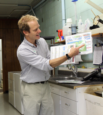
Top Image: Professor John Petersen explains elements of the Environmental Dashboard to members of the Oberlin, Ohio community. Credit: Yvette Chin.
One Comment
Leave a Reply


Dana Plant
February 17, 2016 at 2:11 PM
Hello,
I am on an elementary school Green Team in Kenmore WA. We have just raised $13,500 at our school auction to dedicate our school to going GREEN. I am very interested in hearing more about your Dashboard system.