Lake Erie Infographic
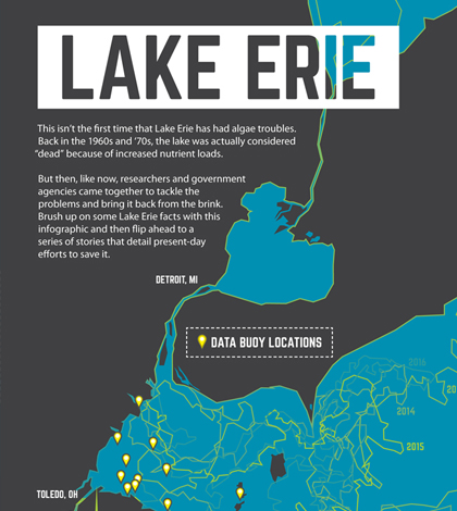
Lake Erie infographic. (Credit: Nate Christopher / Fondriest Environmental)
It’s pretty easy to find a Lake Erie infographic these days. And that makes sense, because the water body is an incredibly important one. We laid out some of the dynamics that make it that way in our most recent print edition, published in fall 2016.
Those include its shallow depth, a factor that makes it one of the most productive Great Lakes both for fish and algae. Another is the population surrounding Lake Erie. Did you know that the Erie watershed has nearly 12 million people? That makes it the most populated area of the region!
In our latest edition, the Lake Erie infographic serves as a nice background for readers who may be unfamiliar with the lake. It also helps to introduce our coverage of Lake Erie’s western basin. The infographic gets there by sharing facts on algal blooms since 2011, where the lake gets most of its water and the locations where data buoys are tracking its dynamics.
Here’s a sampling of some of the western Lake Erie stories we included in our coverage:
If you would like a full-size version of the Lake Erie infographic for personal use, one is available for download on the Fondriest Environmental Flickr page. Check out the Lakes section of our website for more freshwater stories.

Lake Erie infographic. (Credit: Nate Christopher / Fondriest Environmental)


0 comments