Posts for tag "infographic"

Data Buoys Infographic
We put together this infographic on data buoys for our Spring 2017 edition of the Environmental Monitor (PDF available online). Organizations across the globe use data buoy systems to observe and monitor atmospheric and oceanographic conditions in...
- Posted March 14, 2017


Lake Erie Infographic
A Lake Erie infographic from the Fall 2016 Environmental Monitor magazine details the lake’s productivity, algae woes and other facts using a map.
- Posted October 28, 2016

Global Temperatures In 2016
An infographic from the Environmental Monitor looks at global temperatures in 2016, records that have been broken and how it compares to the past.
- Posted September 8, 2016

El Niño And La Niña
The 2015-2016 El Niño has already gone down as one of the strongest ever in history. Some of its effects have included droughts as well as storms and flooding. It may very well have also been a...
- Posted May 13, 2016

Infographic: Polar Ice
The Winter 2015 print edition of the Environmental Monitor had a focus on national parks and specifically the impacts that humans have had on them despite being set aside for protection in the parks system. Here’s more...
- Posted February 9, 2016

Infographic: Invasive Species
Infographic detailing 16 common types of invasive species -- animals or plants that aren't native to a specific location, but thrive after being introduced.
- Posted January 4, 2016

Infographic: Ohio River
It's hard to overstate the importance of the Ohio River to the United States. This infographic looks at the history of the river and it's current health.
- Posted September 18, 2015
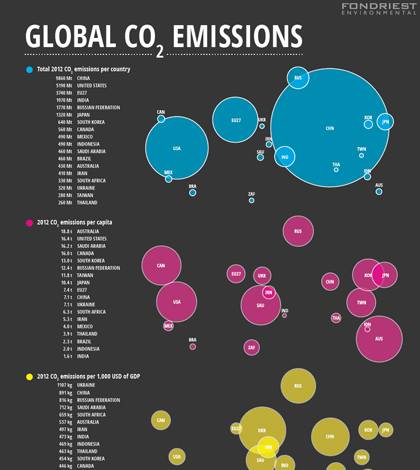
Infographic: Global carbon dioxide emissions
With 2014 officially in the books as the hottest year on record, it’s a fine time to share the web version of our infographic on global carbon dioxide emissions that originally ran in the Winter 2014 (PDF)...
- Posted February 12, 2015

Infographic: Harmful algal blooms
Harmful algal blooms seem to be on the rise, with 158 warnings reported by 21 states in 2013. An alarming 50% of those came from Great Lakes states.
- Posted November 26, 2014